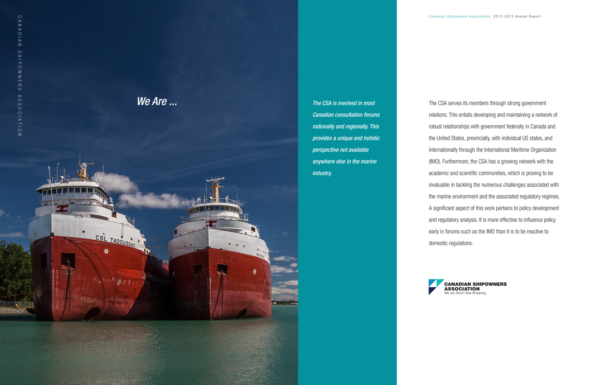

The Canadian ship owners partnered with elected officials and stakeholders to help find solutions to reduce emissions and transition to a lower carbon economy. Their goal was to grow short sea shipping as a safe and sustainable source of domestic transportation with global linkages.
The issue that needed to be resolved in the rebrand was not only update the current logo but to give the organization a more up to date look and feel while balancing this with the need to reflect a broader sense of purpose.
The visual solution was to transition from the literal image of a ship to an abstract representation. The CSA graphic symbol was made up of three differently coloured triangular units that represents the forward hull of a ship as well as their three main areas; inland, coastal and arctic shipping. The solution needed to be flexible enough to be used for a variety purposes, creating a visual structure that allows for dynamic graphic expression.
Services
Brand Strategy / Creative Direction / Visual Identity / Print / Photography


Hangar 13 Inc.
284B Dalehurst Drive
Nepean, ON, K2G 4J5
613.729-3313
Get in touch today to take your next design, video, marketing or web based project to the next level!